English | MP4 | AVC 1280×720 | AAC 48KHz 2ch | 2h 32m | 405 MB
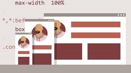
Responsive design demands that websites adapt to the device they are displayed on. Responsive layout is key, and HTML and CSS now offer features that make it easier than ever to create layouts that will work well on a wide range of devices and screen sizes. In this course, Clarissa Peterson covers the basics of designing responsive website layouts with the latest standards, including CSS Flexbox and Grid. Review the basics, such as working with the position and float properties to adjust the location of elements on screen, and discover how to use media queries to proactively update your layout. Then dive into CSS Grid, including aligning and ordering items within the grid, and find out to work flexbox containers. Finally, learn to build a 12-column design that combines Grid and Flexbox in one layout.
Topics include:
- What is responsive design?
- The responsive page structure
- Accessibility and responsive design
- Using media queries
- Designing with CSS Grid
- Designing with CSS Flexbox
Table of Contents
1 Go cross-platform with responsive design
2 What you should know
3 Viewport
4 Required CSS
5 Display property
6 Positioning
7 Floats
8 Units
9 Responsive design
10 Media queries
11 Flexbox and Grid
12 Accessibility
13 Browser support
14 Intro to CSS Grid
15 Defining rows and columns
16 Grid gap
17 Sizing rows and columns
18 Placing grid items
19 Grid alignment overview
20 Aligning tracks
21 Aligning grid items within tracks
22 Aligning individual grid items
23 Variable columns
24 Grid template areas
25 Naming grid lines
26 Ordering grid items
27 Grid flow and implicit tracks
28 Challenge The rainbow box
29 Solution The rainbow box
30 Defining a flexbox container
31 Direction
32 Wrapping
33 Ordering flex items
34 Flexbox alignment overview
35 Aligning items on main axis
36 Aligning items on cross axis
37 Aligning lines on cross axis
38 Aligning individual flex items
39 Distributing space to flex items
40 Challenge Floats to flexbox
41 Solution Floats to flexbox
42 Centering content
43 column layout with grid areas, part 1
44 column layout with grid areas, part 2
45 column layout with flexbox
46 column layout setup
47 column layout for medium viewports
48 column layout for wide viewports
49 Next steps
Resolve the captcha to access the links!