English | MP4 | AVC 1280×720 | AAC 48KHz 2ch | 2h 03m | 345 MB
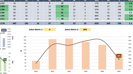
Interested in using more than the built-in chart and graph tools to showcase your data in Excel? In this course—the second and final installment in the Excel Data Visualization series—instructor Chris Dutton steps through how to create unique, custom data visualizations in Excel. Since Chris covered the core data visualization capabilities of Excel in the previous installment of the series, he dives into some more sophisticated techniques here. As he moves through a series of hands-on demos, Chris covers everything from building dynamic dashboards to advanced maneuvers like value-based formatting and dynamic series selection.
Table of Contents
1 Part 2 Introduction
2 Setting expectations
3 Image overlay chart
4 Binary ranges
5 Automation with OFFSET and COUNTA
6 Interactivity with form controls
7 Animating changes over time
8 Building a dynamic dashboard, part 1
9 Building a dynamic dashboard, part 2
10 Value-based formatting
11 Dynamic series selection
12 Custom pacing chart
13 Custom gauge chart
14 Visualizing percentages with arrays
15 Part 2 Conclusion
Resolve the captcha to access the links!