English | MP4 | AVC 1280×720 | AAC 48KHz 2ch | 2h 55m | 504 MB
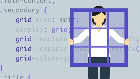
CSS layouts are becoming less of a puzzle. After decades of hacking CSS to make multicolumn layouts, the CSS Grid Layout module makes page layout predictable. In this course, take a step back from traditional layout models, and learn how to take full advantage of the new capabilities of CSS Grid to build interfaces that are attractive, accessible, and responsive. Join Morten Rand-Hendriksen as he walks through how to create full-bleed layouts, multicolumn layouts, and advanced card-based layouts. He demonstrates how to create dynamic responsive grids that adjust to their available viewport space.
Topics include:
- Defining a grid
- Grid lines and units
- Automatic and manual grid item placement
- Planning for grid layouts
- Starting your layouts with pen and paper
- Multicolumn layouts
- Full-bleed single column layouts
- Making the grid responsive
- Various card layouts
- Accessible off-screen navigation layouts
Table of Contents
01-Welcome
02-Using the exercise files
03-Prerequisites
04-Terminology
05-Define a grid
06-Grid lines and units
07-Automatic grid item placement
08-Manual grid item placement
09-Named lines
10-Grid areas
11-Grid gap
12-CSS Grid means rethinking web layouts
13-Start your layouts with pen and paper
14-A new approach to backward compatibility
15-Accessibility first
16-The challenge
17-Overview of the starting point
18-Check for grid support
19-Create the main grid
20-Position items on the grid
21-Add a third column for wider viewports
22-Breaking the grid
23-Justify the grid inside the grid container
24-Use white space to perform magic
25-The challenge
26-Overview of the starting point
27-Check for grid support
28-Create the shared grid
29-Create columns and position grid items
30-Make the grid responsive
31-The challenge
32-Overview of text-based card markup
33-Create a grid for each card
34-Position items on the grid
35-Place the cards on a grid
36-Overview of image-based card markup
37-Using the grid to stack grid items
38-Change the appearance of cards with flex
39-Create different-sized grid items
40-Create a complex magazine-style grid
41-Different off-screen navigation options
42-Off-screen to cover navigation overview
43-Set up the main grid
44-Position the navigation area on the grid
45-Hide the navigation area off canvas
46-Create a reveal effect using JavaScript
47-Improve accessibility of off-screen navigation
48-Overview of sliding navigation panel
49-Create an overflowing grid
50-Slide content in and out of the canvas
51-Bonus – Animate the sliding effect
52-Conclusion
Resolve the captcha to access the links!